
They say that there are no comrades to the taste and color, but in fact, you just need to look closely. This applies not only to the tastes of our friends and environment, but also personal preferences in clothes and, of course, in accessories. It is about them that will be discussed: shades, color and how to find your universal palette. There is one clue: to correctly determine your color, it is worth to start from the shades that prevail in the wardrobe.
Do not go into extremes and say to yourself: I have a lot of gray – then I need a dark bag. Or: I will not take a very bright one, with what will I then wear it?
Rushing from the extreme to the extreme is not an option. If your lifestyle, work assumes restrained or even strict shades, they can be diluted with contrasting details – whether it’s a bag or shoes. In the event that colored things in the closet cannot be counted, do not try to choose a bag brighter than your own bow.
Brands and designers offered a lot of ways out of the situation this season, having beaten basic backpacks and bags in blue, light blue, raspberry, pink, beige and powder shades. Despite its universality, each of the options has features.
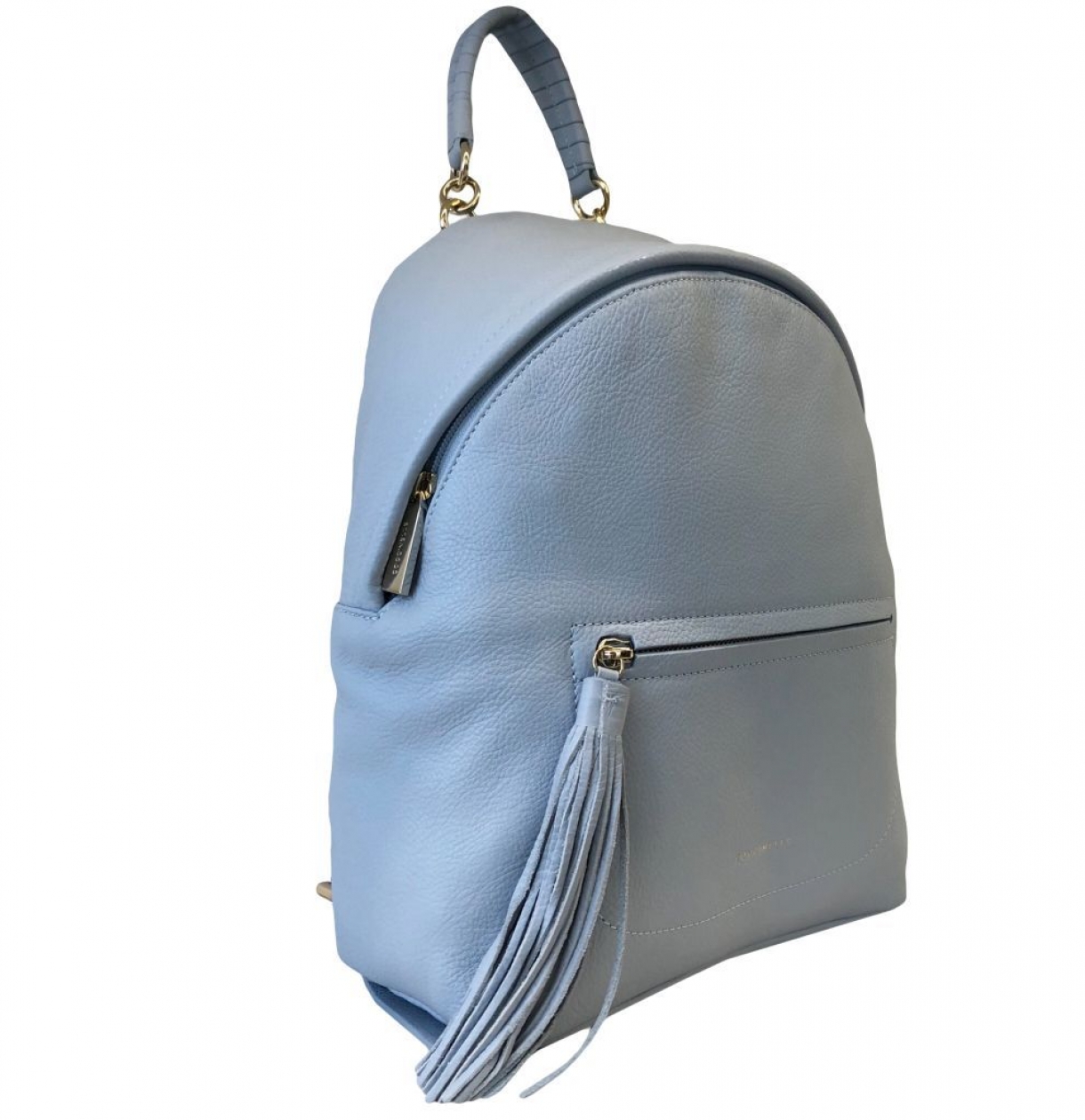
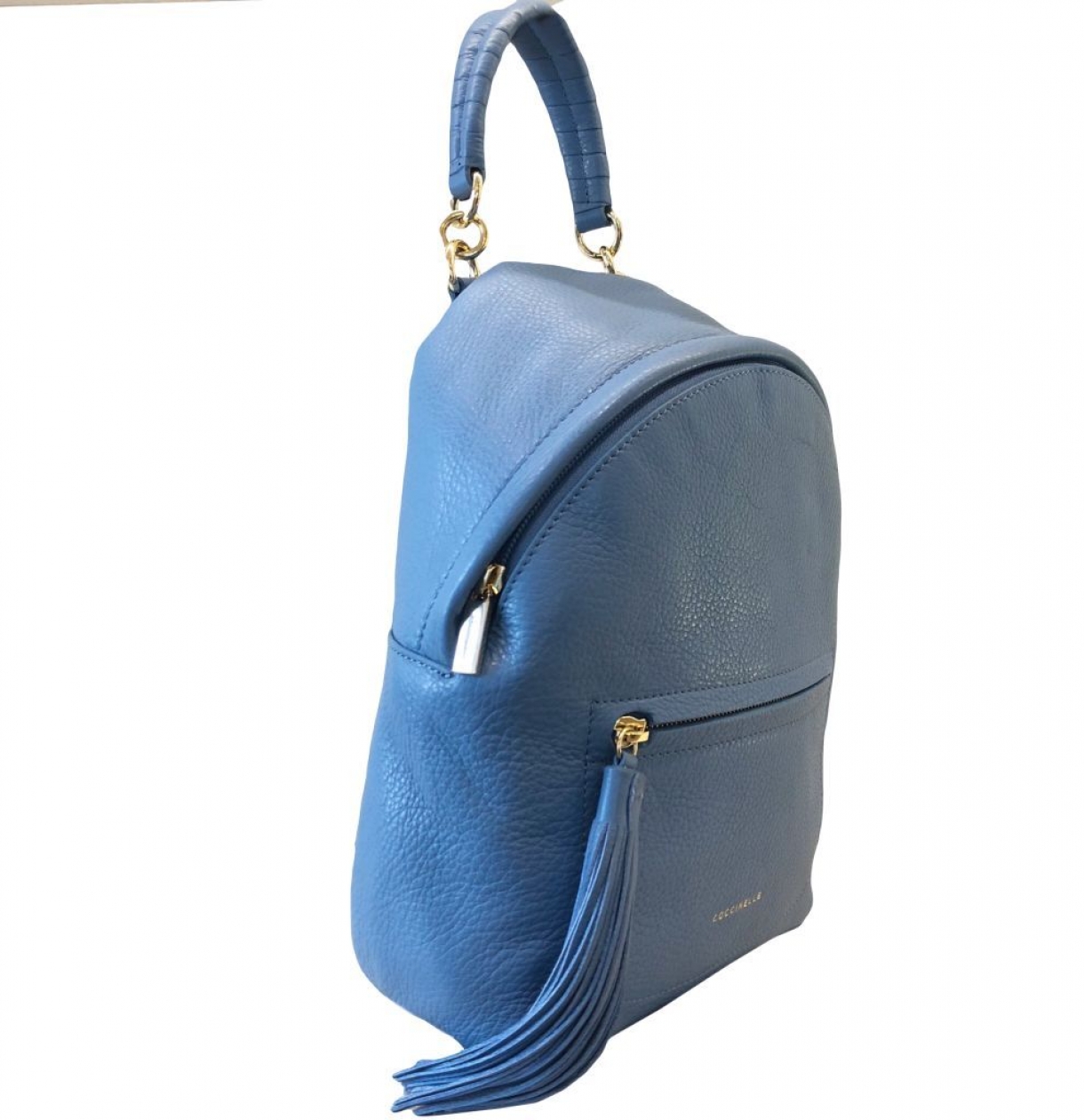
The shades of the blue Ultra Violet or Little Boy Blue ( light and dark ) look better in either monochrome or in the frame of no less bright shades: for example, red, orange, silver, piercing green or bright yellow. Some of this certainly is for everyone.
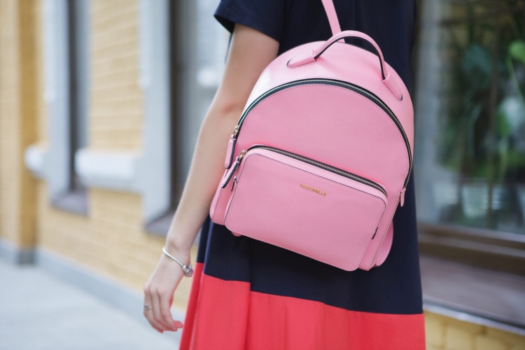
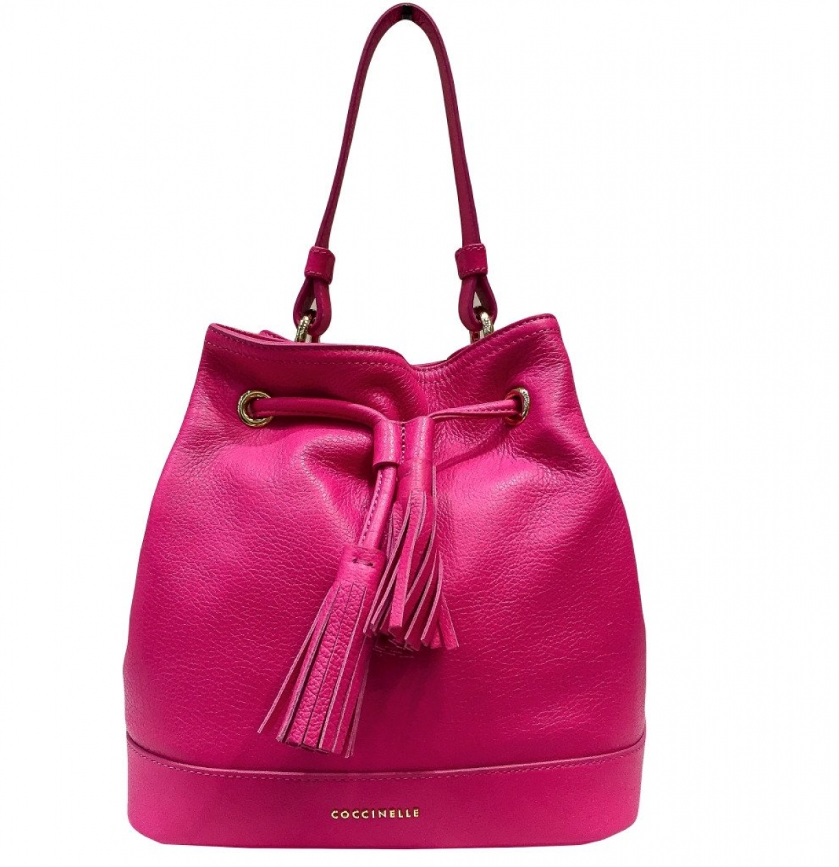
Crimson and pink are not always considered to be “tender” and “girlish”. In fact, many designers and stylists prefer to dilute cocktail images with accessories of these shades, and not only to make them more relaxed.
Sometimes raspberry can be caustic, drawing attention to yourself first, and then scattering it on the whole bow. If the output implies a one-tone dress code, the crimson total look will often be too provocative. In this case, it is worth combining pink with soft nude, beige, gray tones. Well, to make the image more contrast, black, fuchsia, metallic shades will do.
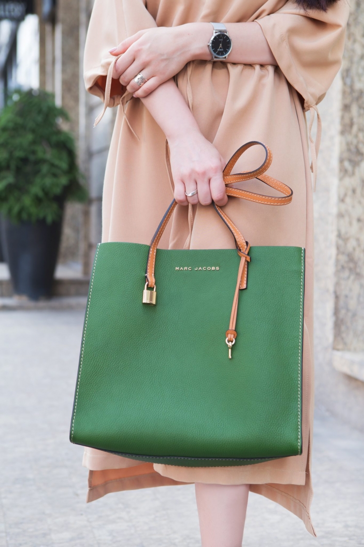
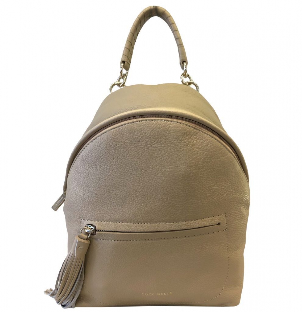
In beige and powdery rules. Many seem to be boring to wear such neutral colors, but in fact, accessories made in these shades are in the right combination as eye-catching as red or even yellow. Moreover, only with them, it is possible to create a perfectly romantic, soft image.
Similar shades are better to beat in the print (ideally a combination with snow-white) or to combine with bright warm colors: red, orange, sky-blue, green.
The above shades fit into the image, they can serve you until the cold seasons, and sometimes cheer up with the arrival of rains. So we can safely consider them as the color base of the spring-summer season.
 July 2020